
One valuable part of our workshops is image review. Feedback is part of the creative process, and helps us become better photographers. There is a lot of criteria for feedback, some aspects focus on technical merits and other feedback focuses on graphic elements. And there is always the more subjective, bigger picture of creativity and vision.
I always tell workshop participants to watch your audience for a reaction when the image first comes up on the screen. This reaction is your first clue revealing how well your image resonates with your audience. Part of communicating visually with your audience is directing the viewer through your image. What is important about your shot, and where do you want the audience to look? Thankfully, there are some simple graphic qualities that will direct the viewer’s eye when they look at your photograph.
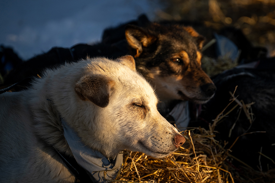
Sharpness. Our brains are seeking interpretation and connection when we view a photograph. We want to understand the visual message. Naturally, the viewer will focus on what is sharp in an image before the blurry parts. When you see a stunning wildlife image and the background is blurred (i.e. bokeh), you look at the tack sharp eyes of the animal first. Your eye might wander after connecting to the sharp areas, but usually only after finding a pleasing sharp anchor point before examining the blurry areas in the image.
Brightness. Have you ever had someone critique your image and say something along the lines of the ‘bright white part of your shot is distracting?’ Bright areas in an image advance and attract the viewer’s attention. Use this to your advantage. Add some flash to your subject, vignette your final image, or maybe look for bright sun hitting your subject against a shadowed background. Maybe you crop out more of a distracting bright white sky to improve your image. Just remember bright spots in your image will catch the viewer’s eye…for better or worse!

Saturation. I love color photography, and use it to my advantage in photography. Strong saturated colors will attract the viewer’s attention. I shot adventure sports stock images for years. Magazine editors and art directors at gear companies wanted punchy images to sell their product. I often heard ‘make sure to have your models wear bright colors’ like red, orange and yellow. Bright saturated colors attract the viewer’s attention. Will you see a black coat or a red coat faster on a skier on a distant snowy peak?
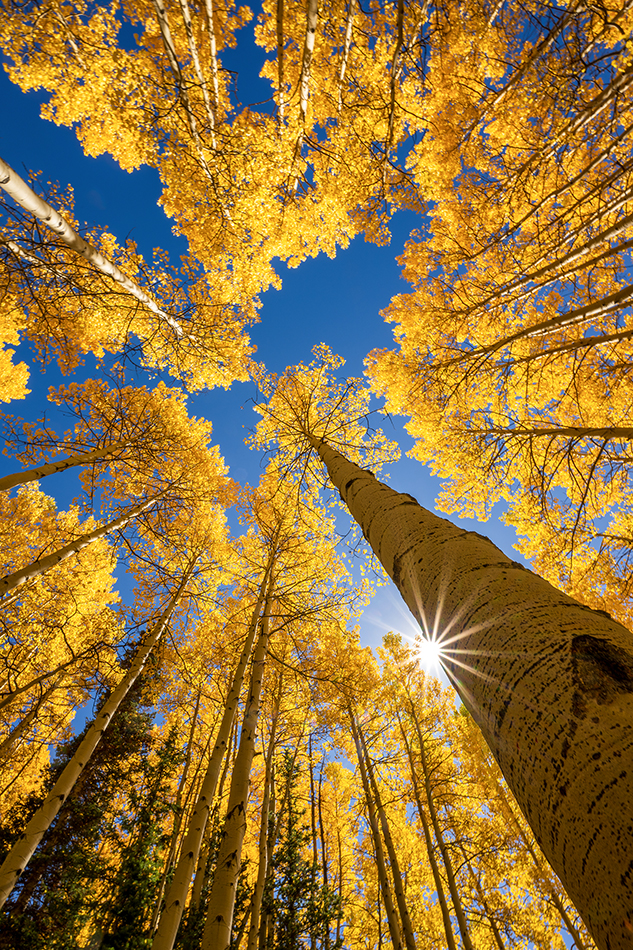
Ouray Colorado. Fall color
Contrast. Similar to color, strong contrast will attract the viewer’s attention quicker than low contrast. Take a look at this fall aspen image above. I deliberately photographed close to the trunk of this tree, and also captured a sunstar, adding strong contrast to this image. I created a visual handrail for the viewer…this strong contrast line connects the foreground with the background and directs the viewer through the image.
Understanding these four principles will help you create stronger images, and better communicate your message to the viewer…